
StreetSmarts: Educating Myself...

Before embarking on this Banksy journey. I was swimming with pictures from the 3 interesting books suggested by my Professor Tracey Salaway. These books were excellent foundations for me to understand the graffiti world and its influences enveloped. My street creed tasks were to create essays and vlogs on each 3 books:
Weirdo Deluxe: The Wild World of Pop Surrealism & Lowbrow Art by Matt Dukes Jordan.
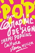
POP: How Graphic Design Shapes Popular Culture by Steven Heller
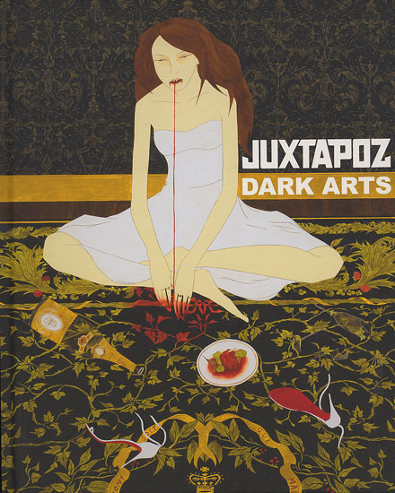
Juxtapoz Dark Arts by Evan Pricco
And I voluntarily added 4th book titled Trespass: A History of Uncommissioned Urban Art.
Hope you enjoy my perspectives on selected artists from the 3 books.
Weirdo Deluxe: The Wild World of Pop Surrealism & Lowbrow Art by Matt Dukes Jordan.
POP: How Graphic Design Shapes Popular Culture by Steven Heller
Juxtapoz Dark Arts by Evan Pricco
And I voluntarily added 4th book titled Trespass: A History of Uncommissioned Urban Art.
Hope you enjoy my perspectives on selected artists from the 3 books.
|
Shepard Fairey Is Not a Crook. Pg45 |
| ||
There was a fascinating excerpt in a book called POP: How Graphic Design Shapes Popular Culture, authored by Steven Heller. On page 45; Shepard Fairey Is Not a Crook was the title of a chapter that I am responding to. It caught my attention, not because of the word crook, but as a street artist whose attention has as much clout as Banksy has. Therefore it was natural for me to choose Fairey to be cohesive for my overall project subject matter on Banksy. “Take Banksy and Shepard Fairey, two undeniably influential urban talents, both with careers firmly rooted in outdoor art, both active for about the same periods of time, yet the makeup of the current markets for their respective work could not be more different”.
Shepard Fairey made his name by designing the iconic Barack Obama "Hope" poster. That poster became the focus of legal and ethical scrutiny - for use of Mannie Garcia’s AP news photo of Barack Obama. The legal issue questioned Fairey’s sampling the existing imagery of Garcia’s. Below is the transformation from the original photo to the iconic poster.
Despite the scolding criticisms, Fairey prospered with the worldwide recognition and reputation. That HOPE poster widely described as iconic and came to represent the 2008 Obama presidential campaign. It consists of a stylized stencil portrait of Obama in solid red, beige and (pastel and dark) blue, with the word "progress", "hope", or "change".
During the 2008 election season, initially independently but with the approval of the official Obama campaign. The design was created in one day and printed first as a poster. Fairey sold 350 of the posters on the street immediately after printing them. It was then more widely distributed, both as a digital image and other souvenirs. The image became one of the most widely recognized symbols of Obama's campaign message, spawning many variations and imitations, including some commissioned by the Obama campaign. This led The Guardian's Laura Barton to proclaim that the image "acquired the kind of instant recognition of Jim Fitzpatrick's Che Guevara poster”.
Looking forward to further developments by this radical artist. Who will Fairey influence? Spawning a new genre?

|
Gary Taxali |
| ||
Gary Taxali is an award winning Indian-born Canadian artist and illustrator with an amazing work ethic and style. The reason I chose him is that he likes to play with various media, techniques, even with languages. Multifaceted artist like Gary Taxali, reminds me of graffiti artists who has to challenge himself on various types of walls, murals, even with various paper to paste onto various surfaces. It considers as an art to me in application of the art onto whatever the media desired.
His works are populated by characters of his own design that look as if they have stepped off the pages of vintage advertisements. Anthropomorphised blocks, shapes and animals all take on emotional power all within a context which is carefully rendered to look from another age.
Taxali has produced a number of books including a couple illustrated for children. He was also commissioned by the Royal Canadian Mint to design a series of coins!
An absolute Outré favourite is his heart warming tribute to the late Maurice Sendak “Wild Forever”.
Taxali’s collaboration with the Royal Canadian Mint has garnered quite a bit of media attention, including a feature on CBC’s The National on Sunday, January 22, 2012. The coins feature Taxali’s recognizable pop culture imagery infused with his retro graphic vintage style. The words “25 Cents”, “2012″ and “Canada” are depicted on the coins in Gary’s famous font called “Chumply,” the first time the Mint has allowed an artist to change the typography on coins.
One of Taxali’s great works, in my opinion is “Lust”, “Hello” and “Speed”. I valued his multimedia, multilingual, and using great imageries from few generations ago. I see great parallel with the graffiti artists’ objectives. Especially the way he uses the vintage papers, decades-old ink, and even 50’s moire onto his works. Many of his artworks are blended with humor of various levels. He earns my namaste.
|
Greg "Craola" Simkins |
| ||
Greg Simkins was born in Torrance, California slightly south of Los Angeles. His artistic ambitions bloomed as early as age three with drawings inspired by cartoons and books. Some of these works, such as The Chronicles of Narnia by C.S. Lewis, The Phantom Tollbooth by Norton Juster, and Watership Down by Richard Adams, still find reference in his art. He grew up with a variety of animals including a number of rabbits, which often appear in his paintings to this day.
Simkins earned his B.A. in Studio Art from California State University, Long Beach in 1999. After graduating, Simkins went to work as an illustrator for a number of clothing firms before moving on to the video game industry where he worked on games for Treyarch/Activision such as Tony Hawk 2X, Spiderman 2, and Ultimate Spiderman. With blessings from his former bosses at Activision, he made the leap to full time artist in 2005.
At the age of 18, Simkins began doing graffiti under the name “CRAOLA”. Graffiti drove his inspiration to create and gave him the confidence and experience to paint large scale works. It also taught him color theory and perspective while further developing his artistic skills as later demonstrated in his masterful work with acrylics.
Out of his love for the animal world he seeks to bring together unlikely camaraderies and conflicts from the landscape of his mind to the confines of canvas, paper, and walls. It is common to see deer with killer whales, puppies with crustacean pals, and birds sharing the air with rodents in his playfully ominous to ominously playful acrylic compositions informed by smooth, graffiti gradients and superbly balanced layouts that draw the eye deftly through complex story lines and rich little vignettes.
By stroke of luck, I admired his Vermeerisque quality of details and accuracies in his artworks. Then I chose to write an essay on this artist. When I first entered his website, I was so thrilled to see his graffiti work amongst his gallery. Thus gave me bigger reason to research and write about him; since he has graffiti background. All the more reason for me to link him to this Banksy project website.